The Atmospheric Sciences Department at the University of Utah is one of the best, if not the best in the country. They put out charts that consolidate 3 of the primary weather modeling systems into one forecasting chart. The chart is cumulative over the time at the bottom, so in the example below, there is a storm coming into Valentine’s Day, another through the 16th, and another on the 19th that cumulatively are forecasted to bring somethere around 90-100 inches of snow.
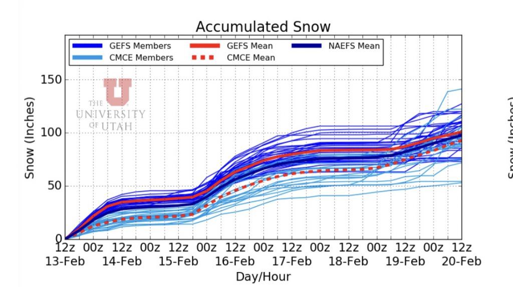
Global Ensemble Forecasting System (GEFS) is a consolidated global forecasting system that pulls in 21 different forecasts from agencies around the world. GEFS is the bulk of the darker blue on graph. Each of the thinner lines represents a plume of forecast probability, the wider they are spread out, the more variability there is in the forecast; the tighter they are the more locked in and certain the forecast is. The solid red line is the mean of all of the GEFS plumes.
North American Ensemble Forecasting System (NAEFS) is the thick dark blue line and represents the mean of the NAEFS modeling system. NAEFS is a collaborative forecasting system which pulls in Canada, the US and Mexico. I generally look at this dark blue line as my go-to when reading the charts.
Canadian Meterological Center Ensembles (CMCE) plumes are represented by the light blue thin lines, and the mean is the red dotted line. This is, as you can guess, a forecasting program out of Canada.
There is a ton of science, data, and money that goes behind what these lines represent. I’m no meteorologist, so I won’t even act like I understand the full force of what is represented here. For me/us, however, these graphs represent incoming snow and maybe some snow in and around the face.